Taming Azure Cost Management: The 2025 Survival Guide
2024-01-01 · ~6 min read
Azure Cost Management has too many blades, scopes, and exports. Learn the core workflows you actually need to make FinOps sustainable.
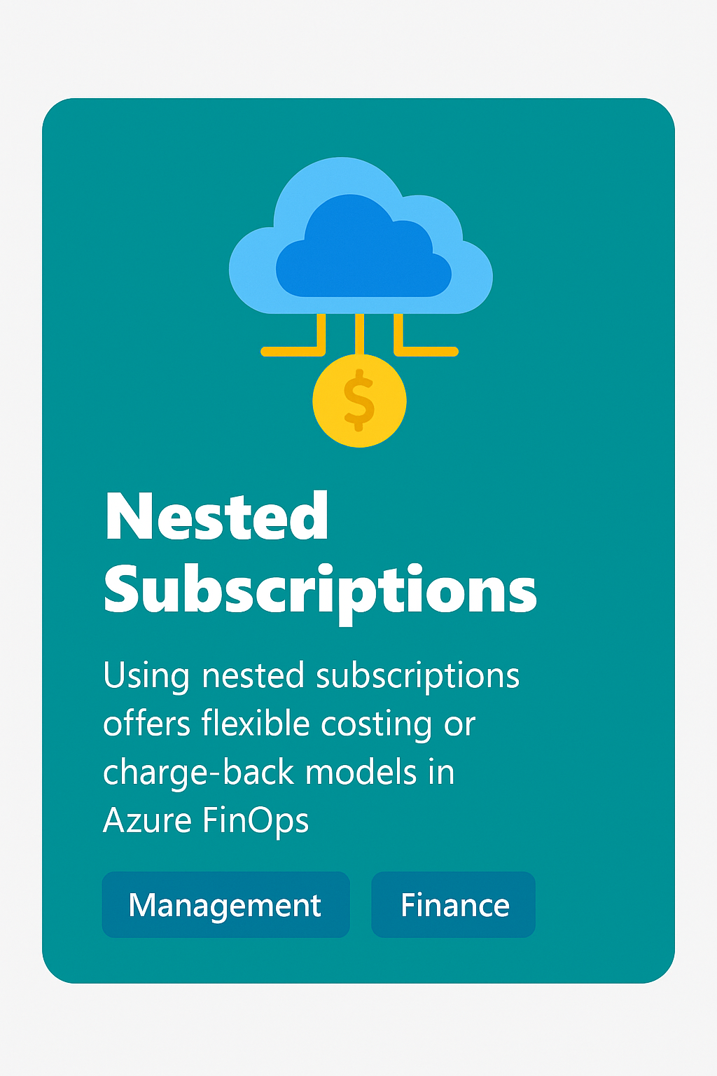
This guide is part of our Azure FinOps hub covering cost management, chargeback models, and financial operations at enterprise scale.
What problem are we solving?
If you've ever opened the Azure Cost Management blade and thought:
"Why doesn't this number match the bill I just got?" — you're not alone.
Between EA vs. CSP billing, reserved instances, mis-tagged resources, and the 36 different cost reports Azure offers, it feels like the system is designed to confuse you. I've burned hours (days) reconciling numbers that should be simple.
The problem: cloud spend is too important to ignore, but Azure doesn't make it easy.
Subscription vs. Resource Group scope
This trips up almost everyone:
- Billing actually happens at the subscription level.
Your invoice is tied to subscriptions — period. - Resource groups don't generate invoices.
They're just a logical container inside a subscription. - Cost reports at the resource group level are just slices.
They're helpful for chargeback/showback, but they will never perfectly match what you see at the subscription scope.
👉 Rule of thumb: Always reconcile subscription totals first. Use resource group reports for allocation, not for truth-in-billing.
Tags: the only way to get sane reporting
As I wrote in my earlier post on tags and governance, if your tags are junk, your cost reports are junk.
Here's my go-to tagging scheme:
Application— what workload/service this belongs toCost Center— which budget/code pays for itOwner— the person or team responsibleEnvironment—Prod,Dev,Test, etc.Type— is it aServer,Appliance, orDesktop
When these are applied consistently, I can slice and dice costs in ways finance actually cares about.
When they're missing? I may as well be reading hieroglyphics.
The Azure Cost Management connector
This is where things start to get powerful:
- The Azure Cost Management connector pulls cost data into Power BI.
- It gives you the same underlying data that drives the portal — but you can automate, transform, and visualize it however you like.
- You can connect at different scopes: subscription, management group, or billing account.
Why use it?
- Automate monthly chargeback reports
- Blend Azure data with on-prem costs or other clouds
- Fix gaps in the portal UI with your own dashboards
What you actually get
Here's what the connector pulls into Power BI:

You don't just get one dataset — you get multiple tables like:
- Pricesheet — contracted rates
- RI Transactions / Usage / Recommendations
- Usage Details — granular meter-by-meter usage
- Amortized Usage — spreads RI costs across benefiting resources
And the connector doesn't just give you raw tables — it wires them up into a data model automatically:

- Subscriptions → filter and group correctly
- Resources → names, groups, and tags
- Usage Details / Amortized Usage → raw vs. RI-adjusted spend
- Pricesheet → actual contracted rates
- Calendar → month/quarter/year rollups
This saves hours of modeling work. Instead of manually joining CSVs, you start with a star schema ready for dashboards.
How much data should you pull?
By default, the connector suggests 3 months of data. That's not random — the files are huge even at 3 months, and refreshes get slow.
My leadership asked me to carry 13 months for trending and forecasting. Sounds good in theory, but in practice I hit constant refresh failures. Even Microsoft support couldn't solve it.
The fix:
- Premium workspace required. Standard Power BI just couldn't handle the volume. Once I moved to a premium workspace, refreshes became reliable again.
👉 Lesson learned: leadership will always want more history, but you have to balance that against technical limits. Start small, scale if you have capacity.
A note on Chris Bowman's Cost Board
When I explored Chris Bowman's Azure Cost Reporting board, one "gotcha" for me:
- His Calendar was a calculated table built in DAX.
- At first, I couldn't find much DAX, which left me scratching my head.
That tripped me up until I realized I needed my own calendar + custom DAX to slice by the tags I care about (Application, Cost Center, Owner, Environment, Type).
Why tags matter (the hard way)
As soon as I put those tags into slicers, I saw just how messy things were:

(Blank)values eating up thousands of dollars in costs- Raw, inconsistent tag strings nobody could actually use
- A few clean ones (
Active Directory,APIM-Dev) lost in the noise
And when a cost shows up as blank in a board-level report, leadership doesn't shrug — they ask who owns this, why isn't it tagged, and why are we paying for it?
That single exercise turned cost reporting into a governance spotlight.
Cleaning messy tags with DAX
This is where cost, meter category, and tags collide.
I created a calculated column to extract a clean Application name from messy tag strings (Rubrik, Citrix, Databricks, etc.), so I could finally answer the leadership question:
"How much does that app cost me a day?"

Calculated column on Resources:
Tags.Application_clean =
VAR Key1     = "Application="
VAR Key2     = "ApplicationId="
VAR Src      = Resources[Tags]
VAR p1       = FIND(Key1, Src, 1, 0)
VAR p2       = FIND(Key2, Src, 1, 0)
VAR UseKey   = IF(p1 > 0, Key1, IF(p2 > 0, Key2, BLANK()))
VAR StartPos = IF(ISBLANK(UseKey), 0, FIND(UseKey, Src, 1, 0) + LEN(UseKey))
VAR EndSemi  = FIND(";", Src, StartPos, LEN(Src) + 1)
VAR EndComma = FIND(",", Src, StartPos, LEN(Src) + 1)
VAR EndPos   = MIN(EndSemi, EndComma)
VAR RawValue = IF(StartPos > 0, MID(Src, StartPos, EndPos - StartPos), BLANK())
RETURN

---

### 🔍 Find the "Blank" Tags

Dashboards hate blanks. Run this to find exactly which subscriptions are guilty.

```kusto
// Identify "Blank" Tags causing reporting gaps
Resources
| where isnull(tags) or tags == "{}"
| summarize Count=count() by subscriptionId
🛑 Who Fixes the Blanks?
Dashboards don't fix themselves.
Download the Azure RACI Matrix to assign the cleanup duty to the Application Owner, not the Cloud Admin.
Azure Admin Starter Kit (Free Download)
Get my KQL cheat sheet, 50 Windows + 50 Linux commands, and an Azure RACI template in one free bundle.
Get the Starter Kit →💰 Stop Guessing at Azure Costs
Get the Azure FinOps Framework with cost allocation templates, tag governance policies, and showback dashboards that finance actually understands.
Download FinOps FrameworkExcel template • KQL queries included • No email required