The Truth About Chris Bowman's Azure Cost Dashboard
2025-10-02 · ~25 min read
Everyone links to Chris Bowman's template. Nobody explains why it's 19GB and needs Premium. Here's what's actually happening.
The Problem Everyone Hits
Someone on Reddit asks: "Does anyone have a good Power BI template for Azure cost monitoring?"
The top answer: "Check out Chris Bowman's template on GitHub."
So you download it. You connect your data. And then:
- Power BI freezes
- Your file is 2GB
- You hit the 1GB limit on Pro workspaces
- You can't refresh more than 3 months without timing out
Nobody in that Reddit thread mentioned any of this. Nobody explained what you're actually getting into. Let me fix that.
Premium Workspace: Not Optional for Production
Power BI Pro limits:
- 1GB dataset size
- ~3 months of detailed cost data
- Refresh timeouts on large datasets
Power BI Premium:
- Up to 10GB datasets (Premium Per User)
- Up to 25GB+ (Premium Capacity)
- 12+ months of data
- Incremental refresh capability
Real cost: $9.99/user/month (Pro) vs $20/user/month (Premium Per User) vs ~$4,995/month (Premium Capacity - P1)
For financial reporting at scale, Premium isn't a luxury—it's required infrastructure.
The Calendar Table Secret
Open Chris's .pbix and look at the data model. The Calendar table isn't imported—it's calculated.
Here's the DAX:
Calendar = CALENDAR(FIRSTDATE('Usage Details'[Date]),LASTDATE('Usage Details'[Date]))
What's happening:
This single line creates a table with every date between your first and last cost record. No manual date ranges. No maintenance. When new cost data arrives, the Calendar table automatically expands.
Why this matters:
- Dynamic date range - Works with any subscription, any timeline
- No gaps in dates - Essential for time-based calculations (month-over-month, trends)
- Single source of truth - All date filtering flows through this table
- Zero maintenance - Updates automatically as data grows
Chris then adds calculated columns for Month, Week, and date flags. This keeps the base table simple and the logic transparent.
The alternative approach (which you DON'T need):
Some templates hardcode dates like CALENDAR(DATE(2023,1,1), DATE(2025,12,31)). This breaks when you hit 2026 or want historical data before 2023. Chris's approach is smarter.
What The Data Model Actually Looks Like
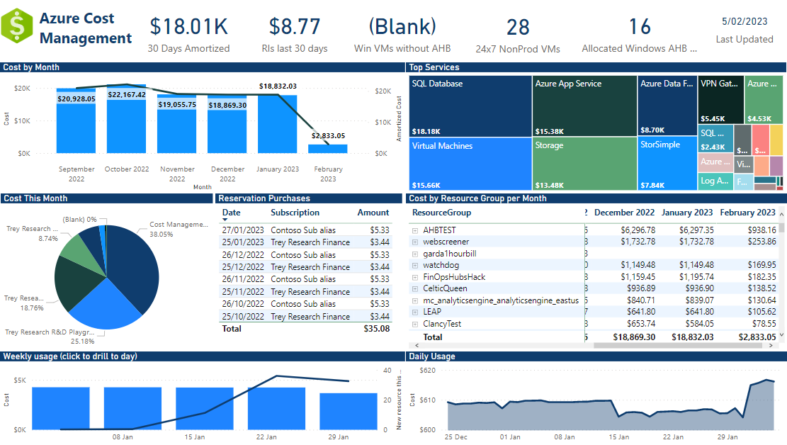
Chris's template isn't just a simple cost report—it's a comprehensive FinOps platform.
The structure:
- 17+ interconnected tables (not a typo)
- Star schema design with Usage Details as the central fact table
- Calendar table connects to time-based data across multiple tables
- Dimension tables for subscriptions, resources, meters, VM sizes
Why this matters:
This isn't "plug and play." This is an enterprise-grade data model that tracks:
- Standard and amortized costs
- Reservation usage and recommendations
- Azure Hybrid Benefit utilization
- VM sizing and optimization opportunities
- License compliance
- Disk inventory
The reality check:
When people say "Chris Bowman's template is 2GB," they're not wrong. You're not just importing cost data—you're building a FinOps analytics platform with 17+ data sources.
This is why Premium workspace isn't optional. This is why the initial refresh takes hours. You're not downloading a spreadsheet—you're constructing a data warehouse.
The Shocking Part: Almost No Custom DAX
Here's what surprised me most: Chris's dashboard has minimal custom DAX measures.
Looking through the data model, most calculations rely on:
- Built-in aggregations from the Cost Management connector
- Relationships between tables instead of complex CALCULATE statements
- Smart data modeling over clever DAX tricks
The calculated columns in Calendar:
- Month (text)
- IsCurrentMonth (boolean)
- Week (identifier)
- bLastDate (date flag)
- btEOM (end of month flag)
Simple, focused, maintainable.
The lesson: Good data modeling > complex DAX. Chris spent time on the relationships and structure, not building elaborate measures.
The Usage Details vs Usage Details Amortized Trap
This is where most people get burned. Chris's template includes TWO cost tables:
- Usage Details
- Usage Details Amortized
They look similar. They are NOT the same.
Usage Details (Actual Costs)
This is what you actually paid and what's on your invoice.
Example scenario:
- You buy a 1-year VM reservation for $12,000 in January
- Usage Details shows: $12,000 in January, $0 for the rest of the year
- Your CFO sees a massive spike and asks "Why did Azure costs explode?"
Usage Details Amortized (Spread Costs)
This spreads reservation costs over the commitment period to show "true" daily consumption.
Same scenario, amortized view:
- You buy a 1-year VM reservation for $12,000 in January
- Usage Details Amortized shows: $1,000 per month for 12 months
- Your CFO sees stable costs that match budgets
Why This Matters
The trap: You build a dashboard using Usage Details, present it to leadership, and they see massive cost spikes that don't match their understanding of Azure consumption.
Or worse: You use Amortized for month-to-month trending, but Finance wants to reconcile against invoices—and the numbers don't match.
Microsoft's guidance:
- Use Amortized for: Budgeting, trend analysis, cost allocation to teams
- Use Actual for: Invoice reconciliation, cash flow planning, understanding what you paid
In Chris's template: Most visuals use Amortized (better for operational reporting), but both tables exist so you can switch if needed.
The fix: Always clarify which view you're using. Add a text box to your reports: "This dashboard shows AMORTIZED costs" or "This dashboard shows ACTUAL costs."
Don't mix them. Pick one view per dashboard and stick with it.
How To Tell Which Table A Visual Uses
In Power BI Desktop:
1. Click on a visual
2. Look at the Fields pane (right side)
3. Check if the measure references "Usage Details" or "Usage Details Amortized"
If you see both tables being used in the same report, that's a red flag.
The 2GB Problem (And Why It's Actually 19GB For Enterprise)
Blog posts and Reddit threads make Chris's template sound simple: "Download, connect, done!"
Here's what they don't tell you about the file size.
The Math Nobody Shows You
My environment:
- Regional bank infrastructure
- 31,000 Azure assets (VMs, storage accounts, disks, App Services, databases, etc.)
- Standard enterprise Azure footprint
Actual file growth:
- 3 months of data: 791 MB
- 13 months of data: 19 GB
Let me break down why this happens.
Why Cost Data Explodes
The line-item reality:
- Each Azure resource generates cost line items
- Most resources bill hourly
- Some bill by transaction or usage metric
- The connector pulls every single line item
Quick math on my 31,000 assets:
- 31,000 resources × 24 hours × 90 days = ~67 million potential line items (3 months)
- Scale to 13 months: ~290 million line items
- And that's just the Usage Details table
- Usage Details Amortized table is similar size
- Combined: ~580 million rows across both tables
19 GB starts to make sense.
The Power BI Pro Trap
Here's the timeline nobody warns you about:
Months 1-3: Everything works
- File size: 791 MB
- Power BI Pro: ✅ Works fine
- You think: "This is easy!"
Month 4: It breaks
- New data arrives from scheduled refresh
- File size: ~1,050 MB
- Power BI Pro limit: 1 GB
- Refresh fails
- Error message is vague
- You start debugging
The realization:
- You calculate: 791 MB ÷ 3 months = ~264 MB per month
- Linear growth would mean: 264 MB × 12 months = 3.2 GB
- But actual growth is exponential
- At 13 months: 19 GB (not 3.2 GB)
- You need Premium from day one if you want full-year history
Why Growth Isn't Linear
File size doesn't just add up—it multiplies. Here's why:
Data model overhead:
- Calendar table calculations expand with date range
- Relationships between 17+ tables create indexing overhead
- DAX measures store intermediate calculation results
- Cross-filtering across millions of rows adds memory pressure
The larger the dataset, the more overhead Power BI needs to make it performant.
What This Means For Different Organization Sizes
Small organization (100-500 resources):
- 3 months: Maybe 50-100 MB
- 12 months: Could stay under 1 GB
- Power BI Pro: Might work
Mid-size (1,000-5,000 resources):
- 3 months: 200-400 MB
- 12 months: 2-4 GB
- Power BI Premium Per User required: 10 GB limit
Enterprise (10,000+ resources):
- 3 months: 500 MB - 1 GB
- 12 months: 10-20+ GB
- Power BI Premium Capacity required: P1 or higher (up to 25 GB per dataset)
My environment (31,000 assets):
- 3 months: 791 MB
- 13 months: 19 GB
- Premium Capacity: Not optional, required from the start
The Cost Reality
Power BI Pro: $9.99/user/month
- 1 GB dataset limit
- You'll hit this at month 4 with any significant Azure footprint
Power BI Premium Per User: $20/user/month
- 10 GB dataset limit
- Good for mid-size deployments
Power BI Premium Capacity: Starts at ~$4,995/month (P1)
- Up to 25 GB per dataset (P1)
- Required for enterprise cost reporting
- This is what I'm running
The Lesson
Chris Bowman's template isn't bloated. The Azure Cost Management connector pulls every line item for every resource.
If you have thousands of resources, you have millions of rows. If you want 12 months of history, you need Premium Capacity.
This isn't a bug. This is reality. And it's why nobody in that Reddit thread mentioned file size—most people haven't run this at scale yet.
Plan accordingly:
- Small org: Start with Pro, see if it works
- Mid-size: Budget for Premium Per User from day one
- Enterprise: Premium Capacity is required, no way around it
- Know your asset count before you start
Common Gotchas (And How To Fix Them)
Here's what actually bit me when setting up Chris's template.
Gotcha 1: Initial Refresh Takes Forever
The problem:
You connect the data source in Power BI Desktop. Click refresh. And wait. And wait.
My experience:
First refresh took 30+ minutes in Power BI Desktop. No progress bar. No indication it was working. Just... waiting.
Why it happens:
The connector is pulling every cost line item for every resource you have. For 3 months of data on 31k assets, that's millions of rows across multiple tables.
The fix:
- Start with a SMALL date range (30 days max) on first connection
- Verify it works before expanding to 3+ months
- Close other applications - this refresh is memory-intensive
- Don't panic if it takes 20-30 minutes on large environments
- Watch Task Manager - if Power BI Desktop is using CPU/memory, it's working
Gotcha 2: File Size Explodes
The problem:
You get the initial refresh working. File is 200 MB. You add another month of data. File jumps to 600 MB. Another month: 1.2 GB. It's not linear.
Why it happens:
Data model overhead multiplies as the dataset grows. Relationships between 17+ tables create indexing overhead. Power BI needs more memory to make larger datasets performant.
The fix:
- Check your file size after every refresh: File → Options and Settings → Options → Data Load → Current File Size
- If approaching 1 GB and you're on Pro: Stop, upgrade to Premium first
- Don't wait until refresh fails to address this
- Calculate your growth rate early: (file size ÷ months of data) × 12 = projected annual size
Gotcha 3: Refresh Timeout In Power BI Desktop
The problem:
Scheduled refresh works in the service, but refreshing locally in Desktop times out or crashes.
Why it happens:
Desktop has memory limitations. The service (especially Premium) has more resources to handle large refreshes.
The fix:
- Don't refresh locally once the file is large (500+ MB)
- Publish to the service and refresh there
- If you need to make changes: modify, publish, refresh in service
- Use Desktop for development/testing with small date ranges only
Gotcha 4: The Shocking Simplicity
What surprised me most: Chris's template has minimal custom DAX.
I expected complex measures everywhere. Instead:
- Most calculations use built-in aggregations from the Cost Management connector
- Very few custom measures
- The Calendar table is simple (just basic columns: Month, IsCurrentMonth, Week)
- No dedicated Measures table organizing everything
Why this matters:
Chris relied on smart data modeling over complex DAX. The relationships between tables do most of the work.
The lesson:
Good data modeling beats clever DAX. But if you're used to well-organized Power BI solutions with a Measures table and documented DAX patterns, this template will feel... sparse.
What I'm adding:
- Dedicated Measures table (not scattered across visual fields)
- Consistent naming conventions for measures
- Comments in DAX for maintainability
- Additional date intelligence measures
Gotcha 5: Azure Costing Knowledge Required
The problem:
This template assumes you understand Azure cost concepts:
- Actual vs Amortized costs
- Reservation vs pay-as-you-go pricing
- Azure Hybrid Benefit
- Cost allocation tags
- Meter categories and subcategories
If you don't know these concepts, you'll struggle to:
- Interpret the visuals correctly
- Explain findings to leadership
- Customize the dashboard for your org
- Troubleshoot when numbers don't match expectations
The fix:
Before implementing this template:
1. Read Microsoft's Cost Management documentation
2. Understand your organization's Azure pricing (EA vs MCA vs CSP)
3. Know which reservations you have and how they're billed
4. Understand your tagging strategy (or lack thereof)
5. Review an actual Azure invoice alongside the dashboard
This isn't a "plug and play" solution. It's a tool for people who already understand FinOps and need better visualization.
Gotcha 6: Filters Don't Always Behave As Expected
The problem:
You filter on a subscription. Some visuals update correctly. Others don't. Or they show unexpected results.
Why it happens:
With 17+ tables and multiple relationships, filter context can be tricky. The Calendar table drives most filtering, but if relationships aren't configured properly, filters won't cascade correctly.
The fix:
- Study the data model relationships carefully
- Test every filter on every visual before presenting to stakeholders
- Use the "View Relationships" feature to understand filter flow
- Don't assume filters work globally - verify each page
The Bottom Line
Chris built a production-ready FinOps platform, not a simple cost dashboard. That means:
- Longer setup time
- More complexity
- Higher infrastructure requirements (Premium)
- Deeper Azure knowledge needed
But the payoff is comprehensive cost visibility across your entire Azure estate. Just don't expect it to be easy.
How To Customize It For Your Org
Chris's template is excellent out of the box, but it assumes your Azure environment has clean, consistent tags. If you're like most organizations, it doesn't.
Step 1: Tag Normalization (The Reality)
The problems you'll hit:
- Environment: prod vs Environment: Prod vs Environment: PROD - Power BI treats these as three different values
- CostCenter: 12345 vs Cost Center: 12345 vs costcenter: 12345 - spelling and spacing variations
- Enviroment vs Environment - typos that split your costs across categories
- Empty tags, null tags, and "Unassigned" - different flavors of missing data
I wrote a complete guide on Azure tag cleanup here: What I Wish I Knew About Azure Resource Tags
Read that first if you haven't dealt with tag governance yet. It explains the problems in detail.
Step 2: DAX To Handle Tag Chaos
Once you understand the problems, here's how I fixed them in Power BI.
Tag Normalization with DAX:
I added calculated columns to the Usage Details table to clean up tag variations:
Clean_CostCenter =
VAR RawTag = UPPER(TRIM('Usage Details'[Tags_CostCenter]))
RETURN
    SWITCH(
        RawTag,
        "COSTCENTER1", "CostCenter1",
        "COST CENTER 1", "CostCenter1",
        "CC1", "CostCenter1",
        "COSTCENTER-1", "CostCenter1",
        "FINANCE", "Finance",
        "FIN", "Finance",
        "FINANCE DEPT", "Finance",
        "", "Unassigned",
        BLANK(), "Unassigned",
        'Usage Details'[Tags_CostCenter]  // If no match, keep original
    )
Why this works:
- UPPER() handles capitalization variations
- TRIM() removes leading/trailing spaces
- SWITCH() maps all variations to canonical values
- Empty strings and BLANK() both become "Unassigned"
- Unmapped values pass through unchanged (so you can find new variations)
You need to do this for every tag you report on: CostCenter, Environment, Department, Application, Owner.
Step 3: Tag Inheritance Hierarchy
The bigger problem: Some costs bill at the resource level (tagged), some at resource group level (different tags), some at subscription level (no tags at all).
Leadership asks: "What did Finance spend this month?"
If you only show resource-level costs, you're missing subscription-level charges like support plans and reservations.
The solution - fallback hierarchy:
Final_CostCenter =
VAR ResourceTag = 'Usage Details'[Clean_CostCenter]
VAR ResourceGroupName = 'Usage Details'[ResourceGroup]
VAR SubscriptionName = 'Usage Details'[SubscriptionName]

RETURN
    IF(
        ResourceTag <> "Unassigned",
        ResourceTag,
        IF(
            CONTAINSSTRING(ResourceGroupName, "Finance"),
            "Finance",
            IF(
                CONTAINSSTRING(SubscriptionName, "Finance"),
                "Finance",
                IF(
                    CONTAINSSTRING(SubscriptionName, "Prod"),
                    "Production-Shared",
                    "Unassigned"
                )
            )
        )
    )
What this does:
1. Use the cleaned resource tag if available
2. If unassigned, check if resource group name contains a cost center identifier
3. If still unassigned, check subscription name
4. If still unassigned, check if it's a production subscription (shared costs)
5. Last resort: mark as "Unassigned"
The iterative process:
You won't get this right the first time. Here's what I did:
- First pass: Created Clean_CostCenter, ran the report
- Discovered: 35% of costs showing as "Unassigned"
- Second pass: Added resource group name matching
- Discovered: Support plans and reservations still unassigned (subscription-level)
- Third pass: Added subscription name matching
- Discovered: Empty string vs null behaves differently
- Fourth pass: Fixed empty string handling
- Result: Got "Unassigned" down to 5% (mostly test resources)
The key insight: You'll keep finding high-dollar "Unassigned" items. Each time, add logic to handle them.
Step 4: Custom Groupings For Leadership
Chris's template shows costs by subscription, resource group, and meter category. Leadership doesn't think in those terms.
What I added:
- Business unit view (Engineering, Finance, Operations, IT)
- Application groupings (Customer Portal, Internal Tools, Data Platform)
- Shared services category (things that don't belong to one team)
Example DAX for business units:
Business_Unit =
SWITCH(
    'Usage Details'[Final_CostCenter],
    "Finance", "Finance",
    "Engineering", "Engineering",
    "Operations", "Operations",
    "IT", "IT Shared Services",
    "Production-Shared", "IT Shared Services",
    "Unknown"
)
Step 5: Executive Summary Page
Chris's template is comprehensive but overwhelming for executives. I added a single-page summary:
What executives actually want to see:
- Month-over-month total cost trend
- Top 5 cost drivers this month
- Budget vs actual (if you have budgets)
- Major variances explained (one text box, manually updated)
Keep it to ONE page. If they want details, they can drill into other pages.
The Reality Check
Time investment for customization:
- Tag normalization DAX: 2-3 hours
- Hierarchy logic: 2-4 hours (iterative discovery)
- Testing and validation: 4-6 hours
- Executive summary page: 2-3 hours
- Total: 10-16 hours of work
This isn't "plug and play." But once it's done, it's done. And your cost reports will actually match how your business operates.
Start here:
1. Run Chris's template as-is
2. Identify what shows as "Unassigned"
3. Add DAX to handle those cases
4. Repeat until "Unassigned" is under 10%
5. Then build custom views for leadership
Don't try to perfect it upfront. Fix the biggest problems first, iterate based on what your stakeholders actually ask for.
When To Use This Template vs Build Your Own
Chris Bowman's template isn't the only way to do Azure cost reporting. Here's when it makes sense and when it doesn't.
Use Chris's Template When:
You need comprehensive FinOps tracking
- Not just costs, but reservation utilization, Azure Hybrid Benefit tracking, VM sizing recommendations
- This template tracks 17+ data sources - it's a full FinOps platform
You have Premium workspace
- Or budget to get it ($20/user/month for Premium Per User, or ~$5k/month for Premium Capacity)
- Without Premium, you'll hit the 1 GB Pro limit fast
You want the Azure Cost Management connector
- Direct connection to Azure Cost Management
- Automatic updates when Microsoft adds new cost data
- No need to manage exports or storage accounts
You're willing to invest in customization
- Tag normalization takes time
- Building hierarchy logic takes iteration
- Executive dashboards need custom work
Build Your Own When:
You need cost exports (not the connector)
- Some organizations require exports to data lakes for compliance
- You're already using Azure Data Factory or Synapse pipelines
- You want full control over data transformation before Power BI
You have complex tag structures requiring heavy normalization
- If your tag cleanup needs Python/Spark instead of DAX
- If you need to join cost data with external systems (CMDB, ServiceNow, etc.)
- If tag logic is too complex for Power BI
You only need basic cost reporting
- Month-over-month trends by subscription
- Simple cost allocation by tag
- You don't need reservation tracking, AHB monitoring, or VM rightsizing
- Chris's template might be overkill
You can't get Premium workspace
- Small org with 100-500 resources might stay under 1 GB on Pro
- But verify file size growth before committing to custom build
The Alternatives
Microsoft FinOps Toolkit
- Built and maintained by Microsoft
- More modular than Chris's template
- Good if you want to pick and choose features
- FinOps Toolkit Overview
Cost Management Power BI App
- Microsoft's official Power BI app for Cost Management
- Less customization, but zero setup
- Good starting point to understand your data
Custom API/Export Solution
- Full control, but you're building everything from scratch
- Use if you have complex requirements Chris's template can't meet
- Budget 40-80 hours of development time
My Recommendation
Start with Chris's template unless you have a specific reason not to.
Even if you end up building custom, using Chris's template first shows you:
- What data the connector provides
- How the relationships should work
- What visuals are actually useful
- What your file size will be at scale
Then customize from there or rebuild if needed.
The worst approach: spending weeks building custom when Chris already solved 90% of your problems.
Quick Start Guide
Here's the minimal path to get Chris's template running. Full details are in his GitHub repo.
Prerequisites
Before you start:
- Power BI Desktop installed
- Azure Cost Management Reader role on the subscription(s) you want to report on
- Premium workspace available (or plan to upgrade when you hit Pro limit)
- 30-60 minutes of uninterrupted time
Installation Steps
Step 1: Download the template
git clone https://github.com/chris-bowman/Azure-Cost-Reporting.git
Or download the .pbix directly from the releases page.
Step 2: Open in Power BI Desktop
- Open the .pbix file
- Power BI will prompt you to connect to your Azure environment
Step 3: Connect to Azure Cost Management
- Select your Azure tenant
- Authenticate with an account that has Cost Management Reader permissions
- Choose the scope (subscription, resource group, or management group)
Step 4: Set date range (START SMALL)
- First time: Use 30 days max
- Verify it works before expanding to 3+ months
- Don't start with 12 months - you'll be waiting hours
Step 5: Wait for initial refresh
- This will take 20-30+ minutes depending on your environment size
- Watch Task Manager - if Power BI Desktop is using CPU/memory, it's working
- No progress bar, just patience
Step 6: Check file size
- File → Options and Settings → Options → Data Load → Current File Size
- If over 500 MB with just 30 days: you'll need Premium workspace
- Calculate growth: (file size ÷ days) × 365 = annual estimate
Step 7: Publish to workspace
- Publish to Premium workspace (not Pro)
- Set up scheduled refresh (daily or weekly)
- Test refresh in the service before declaring victory
Common First-Time Issues
Issue: Refresh fails with timeout
- Solution: Reduce date range, try again
Issue: File size already near 1 GB
- Solution: You have a large environment, Premium is required
Issue: Data looks wrong
- Solution: Verify you're looking at Usage Details Amortized (not Actual) for operational reporting
Issue: Tons of "Unassigned" costs
- Solution: This is normal, see the customization section for tag cleanup
What To Do After Initial Setup
- Run it for a week - understand what data you're getting
- Identify "Unassigned" costs - build your cleanup plan
- Show it to one stakeholder - get feedback before customizing
- Start tag normalization - use the DAX patterns from the customization section
- Build executive summary page - one page for leadership
Don't over-customize before you understand what people actually need.
The Bottom Line
Chris Bowman built a production-ready FinOps platform, not a simple cost dashboard. Reddit threads make it sound like "download and go" - it's not.
What you need to understand:
1. File size is real
- 3 months at 31k assets: 791 MB
- 13 months: 19 GB
- This isn't a bug, it's reality
- Plan for Premium workspace from day one if you're enterprise scale
2. Premium isn't optional for production
- Power BI Pro: 1 GB limit (you'll hit it at month 4)
- Premium Per User: 10 GB limit ($20/user/month)
- Premium Capacity: 25+ GB (starts ~$5k/month)
- Calculate your projected file size before you start
3. The data model is complex
- 17+ interconnected tables
- Calendar table, two cost tables (Actual + Amortized), reservation tracking, AHB monitoring
- Not plug-and-play, but comprehensive
4. Tag cleanup is required
- Enterprise Azure environments have inconsistent tags
- Expect to spend 10-16 hours on normalization DAX
- Build hierarchy logic (resource → resource group → subscription)
- Iterate based on what shows as "Unassigned"
5. Microsoft doesn't document the hard parts
- They can't tell you who owns the connector
- They don't warn about Premium requirement
- They assume small environments with clean tags
- You're figuring this out through trial and error
6. Actual vs Amortized matters
- Two different cost views for different audiences
- Amortized: operational reporting (spreads reservation costs)
- Actual: invoice reconciliation (shows what you paid)
- Don't mix them in one dashboard
The payoff:
Once you get through setup and customization, you have enterprise-grade Azure cost visibility. Leadership can see costs the way they think about the business (departments, applications, projects) instead of Azure's native views (subscriptions, resource groups, meter categories).
Resources:
Chris Bowman's GitHub:
- Azure Cost Reporting Template
My other Azure FinOps posts:
- Azure Cost Reporting for the Boardroom
- What I Wish I Knew About Azure Resource Tags
- Azure Cost Management is Confusing
Microsoft resources:
- FinOps Toolkit Overview
- Understand Cost Management data
- Cost Management Power BI connector
Got questions about implementing this at scale? Drop a comment. If you're hitting the Premium requirement and wondering if it's normal - it is. You're doing it right.
Running this in production? I'd love to hear what customizations you made and what surprised you. Email me at david@azure-noob.com or find me on Reddit.